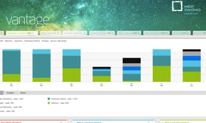
Creating a dashboard is a key part of tracking your PR campaign. With the increasing importance of proving your value to your organization, it’s also a challenge to visually display your measurement findings in a way that your audience—namely, the C-suite at your organization—will understand.
At this morning’s PR Measurement Conference at the National Press Club in Washington, D.C., Allyson Hugley, executive VP of measurement, analytics and insights at Weber Shandwick, shared some tips on how to design a dashboard that is both informative and visually appealing:
- Think less dashboard, more storyboard. By visualizing your data, you are telling a story—plan it out accordingly.
- Make your dashboard look good. Use color—color visuals increase willingness to read by 80%.
- Your dashboard needs to be able to stand alone. If it requires detailed instructions to read your dashboard, most audiences won’t be able to understand it. Create the dashboard as if you won’t be in the room to explain it.
- Start with industry approved or proprietary frameworks. They can act as the outline of your story, and you can use them as an initial guide.
- Progress past the standard version of a dashboard. Figure out how to customize it to meet your specific needs.
- Strive for simplicity. Data visualization that’s snazzy and highly sophisticated can sometimes be unclear. Use a core set of basic charts to start.
Follow Brian Greene: @bwilliamgreene
Excellent description of why visualizing your PR outcomes is great insight on your return on effort. A graphical dashboard should always be accompanied by the data and methodology used to present the visual insights. Universal Information Services, like most professional PR measurement services, adhere to the Barcelona Principles. Transparency in your measurement is important so no reliability questions arise from your graphical representation. Thanks for sharing this info. Great post!
This is a primary example of why agencies are laggards in measurement. These recommendations are useless since they don’t start with the basic requirement — content. What is mentioned is fine if your only objective is to present “bright shiny objects” to decision makers. What is missing here is the substance.