Karl Gude, editor-in-residence, Michigan State University School of Journalism, is a fan of showing, not telling. Gude, who was the director of information graphics at Newsweek for 10 years, says that at their best, infographics can provide a structure for organizing, planning and studying information and revealing hidden relationships. At their worst, they are link bait.
And while making complex infographics can take time and money to produce—and may require input from researchers sales personnel, database managers and designers—, sometimes you can draw the idea on the back of a Starbucks napkin and get by with the help of a single designer.
At PR News' Feb. 27 Digital PR Summit, Gude provided nine recommendations for public relations pros to capitalize on visual opportunities and create infographics—whether it's for a press release or any other communications vehicle.
1) Show where it is: Make a map. "There's a story in a map," Gude said. He stressed that a band's cross-country tour, which is usually shown in a list of cities and dates on the back of a poster or T-shirt, is a great example of visual mapping and storytelling.
2) Compare it to something else: Side-by-side analysis can provide an audience with a engaging contrast and compare-style graphic that the eyes can scan.

3) Highlight for emphasis: Infographics can help emphasize stats or numbers, and "it doesn't mean just making a big purple number," Gude said. "There are elegant solutions used for emphasis." As anm example, Gude cherry-picked important sections of an email chain for a criminal case and highlighted certain sections.
4) Explain it with a drawing: "You may sometimes need really good designers, but sometimes you can draw the idea on a Starbucks napkin," Gude said. After the September 11 attacks Gude quickly scrawled on a napkin the sequence of events and the destruction of the towers and the surrounding area, and the idea was developed from there.
5) Organize items into groups: Gude said that organizing a company's products into groups can make them more easy to understand. He provided an example with the wide world of Microsoft product offerings that included products for the home; for multimedia content; for the workplace and for communications.
6) Break things down: Gude used an example of a soldier and all of his equipment breaking down in order to demonstrate that the most well put-together images are interesting when looked at in their individual parts.
7) Show structure of a hierarchy: Gude said that tree diagrams and other types of directional relationships can provide a visual narrative for readers to follow along.
8) Use a flow chart: Gude discussed a simple example with an organization's business strategy going from one stage to the next.
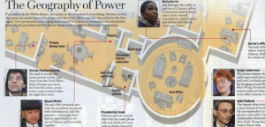
9) Look away/cut inside: During president Bill Clinton's scandal with Monica Lewinksy, Gude created a cutaway of the White House that showed the geographic locations of rooms in relation to one another.
Free tools are available at freevisiualtools.wikispaces.com for graphics.
Follow Bill Miltenberg: @bmiltenberg; Follow Karl Gude: @karlgude


So many typos! But interesting content.