Sure, it’s not a secret: Instagram is a visual channel. Still, some communicators take this idea to a higher level. One of them is Erica Campbell Byrum, AVP, social media at apartments.com, as can be seen in these two slides from a recent PR News presentation.
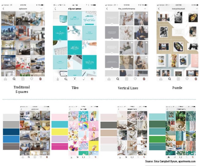
The upper slide illustrates options for brands’ Instagram grid layouts. Beyond looking attractive, though, a layout will help visually organize a brand’s Instagram feed, she says. “This also helps when organizing your content calendar because you will know exactly what type of photo you need to post and when.”
From left, Traditional Squares are “super simple. Just post your photo, each square at a time.” With Tiles, brands alternate between a photo and a quote. Vertical Lines usually are composed of quotes on a solid background. Puzzle, she says, is an advanced layout. “The trickiest part of doing this layout is maintaining the high quality of each single image after you split it.” In addition, “You want to make sure each individual photo makes sense on its own.”
The bottom slide, which provides color scheme options, seems simple on first glance. It’s not. Using photos featuring the same 3-4 colors helps brands maintain content consistency, which is critical, she says. Users are more likely to respond to Instagram feeds they recognize as familiar, she says. A color scheme “makes your overall feed look cohesive and the same colors give a consistent mood to your whole feed.”
CONTACT: ebyrum@costar.com