[Editor’s Note: In our regular feature we ask communicators to spot trends and tell us their reaction to them. This week we hear from Barbara Moreno, executive director, communications, San Diego Convention Center.]

Comms, San Diego Convention Center
The Trend: How much time do you need to make an impact? It’s hardly news that in today’s world consumers are pressed for time and so give communicators very little of it. How little? A fun fact or maybe an annoying one: Someone with a digital device in hand now shares the same attention span as a goldfish. Let that sink in.
Everything we want is just a swipe or click away. With that expectation, consumers demand that everything from apps to news and even videos fit within just eight seconds to earn their full concentration.
This must be considered when it comes to brands’ marketing/communications/PR strategy.
The Reaction: How can a communicator get a message across with only seconds to make an impression? At the San Diego Convention Center, we embarked on a strategy where infographics became the signature piece of our storytelling. During team meetings, we agreed that the brands we follow rely on visual storytelling to catch our eyes and hook us. Our team of talented in-house designers accepted the challenge.
The first task was to begin creating a monthly economic forecast infographic. The goal: Explain the Convention Center’s economic benefit to the region by showcasing revenue generated from one month of conventions.
The visuals were designed to be bright and simple. The overall strategy relies heavily on photos and custom icons. We began developing a branding style guide and library of our preferred graphics and colors.
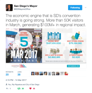
Next, we decided to post the economic forecast infographic wherever our audience was: Twitter, Facebook, Instagram and YouTube. The forecast also replaced a typical press release and was sent via email campaigns to our media partners. Our social media audience has responded to the forecast infographics. We also got an unexpected boost in March when one of our most important stakeholders shared and championed one of our infographics: City of San Diego Mayor Kevin Faulconer [see graphic above].
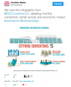
Our department also has watched media outlets utilize data from our infographics when covering news about the Convention Center. What has become evident is that infographics serve a secondary purpose: The information in them becomes an added media asset that reporters use to enhance their storytelling. Here is an example from Facilities & Destinations Magazine [see graphic below].
The next step for us was to use graphics and infographics as visual hooks for engagement or as vehicles to prompt audience click-through.
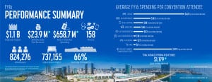
Strategically, we decided to rethink the Convention Center’s annual report. As you can see from the graphic [below, left], the usual text-heavy pages of financial reporting are gone. We can tell a story now with pictures, using the text as supplementary content. And the result has been award-winning.
Graphics and infographics helped create a new kind of content strategy for us, where we promoted the report using infographics designed for the report. To track the success of our campaign strategy, our digital analyst added Google Analytics’ campaign to our social media posts. That way we could track the infographics that drove readership the most. The data we collected has helped us create benchmarks and improve our visual storytelling for future campaigns.
We even took things one step further by creating animated videos using just graphics and infographics to promote our calendar-year forecast. Watch it here: bit.ly/2qGtpB9
We are proud to have won awards for our progressive approach to visual storytelling. The one constant about PR is that the landscape always is changing. If you’ve not done so, think about adapting your messaging method to stay relevant.
Source: San Diego Convention Center
Note: This content appeared originally in PR News, May 8, 2017. For subscription information, please visit: https://www.prnewsonline.com/about/info
CONTACT: barbara.moreno@visitsandiego.com