Put three journalists on a panel, sit them in front a roomful of communications pros and ask them what makes them notice a pitch, and one thing the journalists will likely mention is "unique data, presented simply and visually."
Take any business situation where a strategy needs to be explained and analyzed, and ask those who are on the receiving end of the strategy pitch what they really want from a presentation, and they'll likely say, "unique data, presented simply and visually."
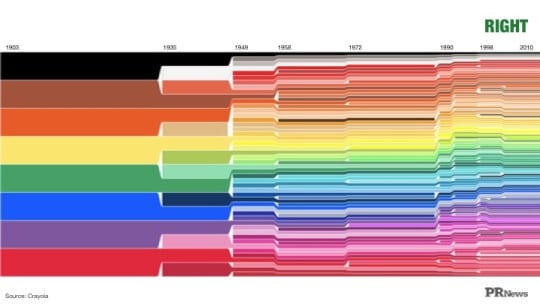
Share the key findings of a study on social media and, well, you know what people want on social media—unique, telling, bold visuals of all stripes.
"We know data visualization is important, but that doesn't mean it's easy," said Kevin Hartman, head of analytics, consumer, government and entertainment for Google, at PR News' Visual Storytelling Boot Camp in Chicago on June 22. "You have to keep your storyline simple and readable," said co-presenter Carolyn Barth. "And you have to know your audience and think about what's practical for them."
Hartman and Barth offered several straightforward recommendations to help communicators visualize data insights with impact:
Know the story you want to tell with your data. This is the starting point for all successful data visualizations, Hartman and Barth said.
Highlight your message to eliminate distractions. "You should approach your data the way a sculptor approaches a block of stone," said Hartman. "You need to chip away at your data and focus on what matters."
Use visual cues to help lead your audience through your insight. Visualized data should tell a story that can be understood in seconds. If someone has to puzzle through a chart, it's a waste of resources.
Use contrast (size, color) to capture the reader’s attention (and imagination). "Tools like Adobe Color Picker can show you a number of color schemes and hues that work well together," said Hartman. "There are tons of resources out there for us to choose among shapes and colors."
Use tests to improve your design. Hartman recommends the following tests:
- The Spartan test: Would eliminating an element change anything? If the answer is no, get rid of it. Earn your reader's trust by giving them only what they need.
- The peek test: Where is your eye drawn? Look away from your visual for five seconds, then back to it. This is most likely the place your audience's eye will be drawn as well.
- The colleague test: Think your visual is perfect? Have a colleague take a look. Give them minimal context and 10-15 seconds to process and ask what they would take away.
One you have a popular infographic on your hands, turn it into a press release and pitch it to the media. "You never know which of your infographics are going to get real traction on social media," said Barth.
Become a data visualization practitioner—do it yourself. "If you make infographics yourself you'll become a better consumer of them," said Hartman. You'll know better than any graphic designer or outside agency which is the best story to tell with your own data. Hartman recommends Tableau as an easy-to-use graphical-based product for making infographics, as well as Google Data Studio and Microsoft PowerPoint.
Follow Carolyn Barth: @CarolynBarthPR
Follow Kevin Hartman: @kevinhartman
Follow Steve Goldstein: @SGoldsteinAI