When you’re a well-known brand it seems just a glance at your logo and nearly everyone knows who you are. Some companies are so well known, they can dispense with words.
You don’t need the word “Nike” plastered on your workout togs. All that’s required to know who created your gym gear is that upward swoosh. A white apple with a bite taken from its right side revals who built your laptop. Ditto your coffee, where a green-and-white mermaid with a star-topped crown on her head makes it obvious where you buy your drink.
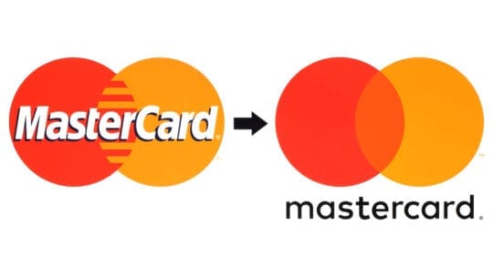
Early last month at CES, a financial services brand that describes itself as “a technology company in the global payments business,” joined the league of wordless logos. The interlocking yellow and red circles took to a stage in Vegas as soloists and were immediately recognizable. At that moment the word “Mastercard,” which, for the record, not long ago was “MasterCard,” became obsolete.
Fools Rush In
Like everything a 53-year-old, “priceless” brand does, a logo change is best approached with care and consideration. It’s the same for communicating about it, Christine Elliott, Mastercard’s EVP of global communications, tells us in an interview. “We’re being pretty strategic about it,” she says.
With thousands of releases dropping at CES, the chances of breaking through were small. As a result, her team issued a release with a simple headline that it thought was unusual enough to entice journalists’ CES-weary eyeballs: “Mastercard Evolves Its Brand Mark by Dropping its Name.” It worked.
More important, she says, those words found their way into media headers. AP’s headline: “No words: Mastercard to drop its name from logo.”
After the release, Mastercard worked fast to get out the word about going wordless. First use of the new logo was at last month’s Australian Open tennis tournament.
Internal Communications
Internally, Elliott says employees had “an overwhelming response” [to the wordless logo]…they’re excited to change their email signature” and business cards. “We’re thinking about interesting ways to show the [logo] at our locations.”
Mastercard also is handling internal communications strategically. Prior to the change, employees were polled about their opinions and asked to submit comments. They were kept informed via Mastercard’s intranet and electronic billboards. Employees are “sharing this story” more than past stories, Elliott says.
In terms of measuring the effort overall, when we spoke with Elliott, the new logo was barely two weeks old and measurement was mostly anecdotal, including positive reviews from media. There also was good feedback from the design community and retailers, who, during a January conference in NY about the future of retail, discussed “how much more a symbol will be integrated into the way that commerce operates…you get that visceral response from an image…versus the written word” in B2B, B2C and “obviously our sponsorship properties.”
As the interlocking circles are integrated into Mastercard’s signage, “excitement will be a benchmark for us.”
Research First
As we noted, Mastercard was deliberate about going wordless. “It was one of the biggest announcements in our history…so it was not taken lightly.” Accordingly, global research preceded the move. “The intent was to ensure that…the public felt” the logo was iconic and recognizable sans words.
Raja Rajamannar, chief marketing and communication officer, says more than 80% of those surveyed “spontaneously recogniz[ed]” the interlocking circles. “We felt ready to take this next step in our brand evolution.”
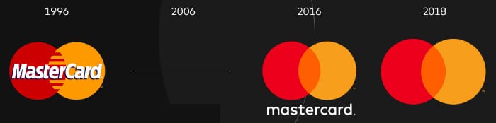
Michelle Lee, a graphic designer at Venngage, says Mastercard made the right move. “A mistake many brands make is changing their logo without researching it first,” she says. Another mistake, she says, is going wordless without being sure your logo is recognizable. She also applauds Mastercard’s move in 2016 to “set the stage” for the wordless logo, moving the word Mastercard under the circles (see graphic).
Why Change?
The big question, of course, is why undertake a logo change? The cost can be enormous. Elliott concedes, but says, “We are being very thoughtful” about “how we roll it out.” It will be done in stages across Mastercard properties.
But why make the change at all? “Today, a picture is worth a thousand words,” Elliott says. “We thought those interlocking circles are iconic...what better way is there to communicate [being at the nexus of technology and commerce] than to let them speak for themselves?”
Adds Rajamannar, “Reinvention in the digital age calls for modern simplicity.”
Note: A version of this content appeared originally in PR News, February 2019. For subscription information, please visit: http://www.prnewsonline.com/about/info
CONTACT: dan.kloeffler@ketchum.com