Are you a PR executive who lacks a strong relationship with your company’s IT department? Now you have a perfect excuse to fix that: Google’s recent and significant overhaul of its search algorithm that boosts search rankings for “mobile-friendly” sites.
The move, which media mavens refer to as “mobilegeddon,” means that Google searches from mobile devices now will favor websites that adjust to or are built for smaller screens.
“The Year of Mobile” long has been a trope for online communications. The expression was meant to signify the gradual, yet steady shift of consumers to hand-held devices and away from their desktop computers when looking for (and receiving) news and information.
Well, you won’t hear about “The Year of Mobile” anymore. That’s because with Google changing its algorithm, mobile officially has arrived at the core of marketing communications.
There are steps PR managers can take to make certain their websites are more mobile-friendly, according to Chris Lucas, VP of marketing at Formstack, an online form builder.
These include: creating a specific and well-placed CTA (call to action) button, which can help juice conversion rates on mobile pages; embracing Social Autofill features, which reduce customers’ time [monkeying around with forms, etc.] on site and mitigate forgotten login information; and making sure on-site resources, such as forms, are as mobile-friendly as the rest of the site [see sidebar below for more tips].
KEEP CALM AND MOBILE ON
While the term ‘mobilegeddon’ conjures images of websites collapsing because they don’t adhere to Google’s new algorithm, the search-engine king offers a bevy of testing tools and diagnostics to check if a Web page is mobile-ready, such as Mobile-Friendly Test tool and PageSpeed Insights.
“Don’t panic,” counsels Dave Armon, CMO of 3BL Media and former president of Critical Mention, when asked how PR managers should respond to Google’s move.
“If you’re a PR manager, keep concentrating on producing quality content that’s unique because that trumps other factors in search results,” Armon said, adding that Google looks at 200 factors when ranking content. “Yes, making a page mobile-friendly now is one of those 200 search success factors. But a legacy website with timely, authoritative content should still rank higher than one that looks great on an iPhone but carries poor quality content”
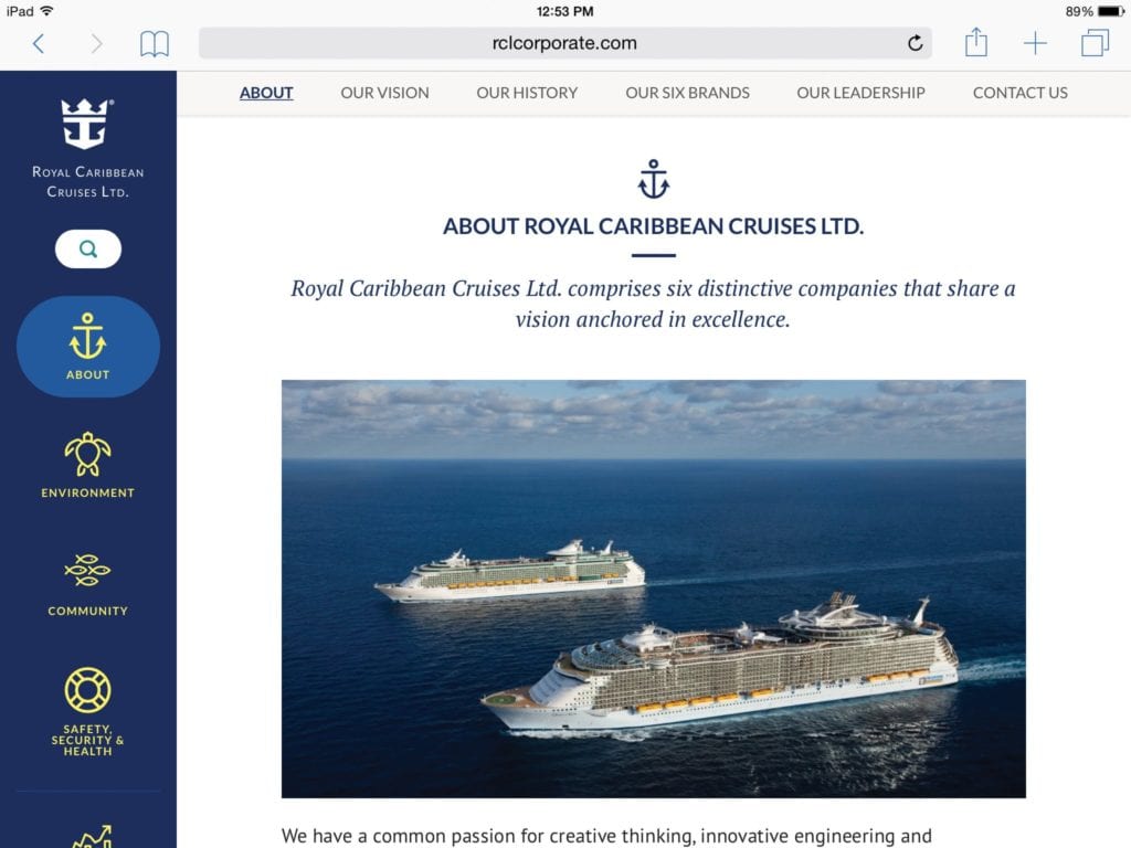
Organic content and mobile-friendly messaging are at the heart of Royal Caribbean Cruises corporate website, which rolled out in March.
“Our senior executives understood that if you want to get out a message, you have to send it in a format that people are used to,” said Cynthia Martinez, director of global corporate communications at Royal Caribbean Cruises. The new site was specifically designed for smartphones, tablets and other hand-held devices, she added.
SHORTER MESSAGING
In developing the website, Royal Caribbean Cruises worked to minimize the amount of scrolling necessary to navigate around the site, Martinez said. It also made sure that each section had its own dedicated page (as opposed to several sections vying for real estate on the same Web page). Social media buttons are prominently displayed to make it easy for users to share content.
The site has just two sections. The first is focused on corporate information; the other offers organic content produced for the site. “You have to think about the end user” when reconfiguring websites to make them mobile-friendly, Martinez added. “Just think about yourself and how you access content on mobile devices.”
Another outcome of Google’s change: shorter communications may become the norm going forward, said Kimberly Maki, corporate VP of comm. and public relations at cable operator and Internet provider Bright House Networks.
“Communicating to the message recipient via multiple page communications becomes cumbersome to read on a mobile device,” she said. “Ensuring you understand what action you want your target audience to take and how it will consume the information are very important.”
SIDEBAR: HOW TO HANDLE MOBILEGEDDON

If Google changing its algorithm has you scrambling, it’s time to look at how mobile-friendly your website is. Here is a 4-step plan to get your site on the right path:
- Start with an SEO audit of your site. This should encompass architecture (coding) and content (how well your content is optimized for display) to understand obstacles that should be addressed as you work to make it mobile-friendly. If you aren’t following best practices, the site audit will highlight that.
- Use one of the mobile-friendly test tools that have appeared online in the past few months. A Google search will bring up several options. This should complement the site audit and, if needed, convince key stakeholders that attention and investment in resources are warranted.
- Understand your server setup. The setup, website architecture and budget will determine which mobile-friendly option is ideal for you. Development and IT should work hand-in-hand to determine if the solution is a responsive design website (best option), whether you should use dynamic serving (less ideal), or create a separate mobile website (least ideal).
- Don’t rush. Avoid setting unreasonable goals just to get a mobile-optimized site up quickly. You are better off carefully optimizing your site than rushing to make a quick fix.
Kareem Harper is VP of measurement and analytics at Weber Shandwick. He can be reached at [email protected]
CONTACT: Dave Armon, [email protected]; Kimberly Maki, @BrightHouseNow; Cynthia Martinez, [email protected]
This article originally appeared in the May 4, 2015 issue of PR News. Read more subscriber-only content by becoming a PR News subscriber today.