There’s a well-known tactic endemic to Washington, D.C., but used elsewhere, too. It’s the old if-you-don’t-really-want-people-to-pay-attention-to-something-issue-a-report-about-it trick. In the old days after receiving a hard copy of such a report you might glance at the cover, perhaps see if you’re mentioned in it, look at the executive summary and put it on the shelf to become another selection in the buffet for dust mites. Today’s equivalent is the desktop folder: a few clicks and the report now can gather virtual dust.
Communicators know this issue intimately, perhaps most when it comes to internal reports or memos. Oh, you can write them just fine, but try getting people to read or react to the document you spent hours composing. All of this boils down to engagement, of course, a constant torment of the communicator.
What’s a Communicator to Do?
This was the dilemma for Kevin Kautzky, group communications manager, energy and environment directorate (EED), Pacific Northwest National Laboratory, Richland, Washington. He wanted to let senior lab leaders know what his team of 14 communicators was doing to spread the word about EED's scientists. But how best to do it? “You produce a report, you send it to people and it gets lost,” he says. “People get so much email today.”
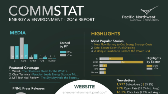
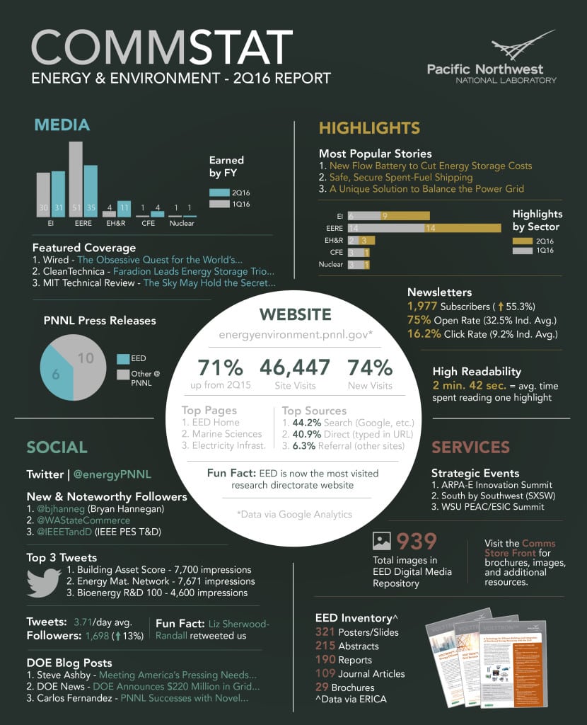
Instead Kautzky and his team at the federal laboratory came up with the one-pager you see below. Kautzky describes it as “a digestible” way for senior leaders to view his team’s quarterly output. In addition to containing a slew of data, the infographic with the “high-tech look” scores points with the Lab’s senior leader, who is a fan of the visual approach to data, he says.
Sorry, We Don’t Deliver
Here’s the kicker: Kautzky and his staff don’t routinely deliver the document to senior leaders. “We [on the communications team] all have copies…it’s a morale booster for us,” he says. “We post it on our office doors, and have the e-version on an internal webpage.” Team members also use it as a leave-behind when they meet with senior lab leaders. What, no electronic delivery to lab leaders? No, the approach, instead, “is to build buzz” around the document by not delivering it each quarter. “When our senior leaders see it…they usually want to know more. When they initiate the discussion it seems to resonate more than us just putting out a report.” Adds Kautzky, “Its almost like a targeted marketing approach where we look to deliver our product to our customer when they are ready to consume it.” It’s worked.
Created using Adobe InDesign in 8-10 hours, the document features a data circle (middle) relaying web site visits, new visits, top web pages and top traffic sources to the laboratory’s site. You’ll note the EED home page leads the list of the lab’s top pages. This data comes from Google Analytics. Data seen in the infographic’s four quadrants (counter clockwise from top left: media, social, highlights and services) are collected “from a few internal systems and our social and web analytic tools,” he says. The top left corner shows traffic to EED’s five core research areas, each of which has a panel on the site. From left they are: Electricity Infrastructure (EI), Energy Efficiency and Renewable Energy (EERE), Environmental Health and Remediation (EH&R), Clean Fossil Energy (CFE) and Nuclear.
In addition to the serious metrics, there are also fun facts, such as the one in the lower-left quadrant. It notes Deputy Secretary of Energy Liz Sherwood-Randall retweeted one of EED’s tweets. And there is material included to be conversation starters, such as top tweets from EED’s @energyPNNL account (bottom left) and “new and noteworthy followers” on Twitter. In this case one new follower was Bryan Hannegan (@bjhanneg), associate laboratory director, National Renewable Energy Laboratory. On the back of the sheet are pictures of Kautzky’s team and quotes of praise from senior lab leaders.
In sum, the infographic is an intentional mix of “sizzle and steak,” he says. There are a lot of “great graphics and charts out there, but we want people to talk about this,” Kautzky says. They do.
CONTACT: [email protected]
NOTE: This content first appeared in PR News Pro, August 8, 2016. For subscription information please click here.