
Launching a visual infographic campaign can be intimidating. The infographics building process is complex and can be time consuming, but pays off in the long term with increased brand loyalty and powerful stories that audiences are far more likely to retain than written content. Data visualization experts know that clearly defined goals, reputable data, concise messaging and a good story are crucial to constructing effective infographics.
At PR News' Visual Storytelling Boot Camp Aug. 9 in San Francisco, we heard from three such infographic experts, all of them communicators well-versed in executing visual data campaigns. Below, four key takeaways from the session, "Break From the Pack with Data Visualization & Infographics."
Define your goals, desired audience and campaign timing. All three panelists noted the importance of knowing your target audience (including the outlets they rely on for information) and timing of campaign delivery before building out an infographic. Amy Roberts, visual designer at Google, broke down infographic targets into four categories: the "who" (readers, viewers, customers), "what" (brand story, information, content), "where" (social channels, brand website, syndication/outlet) and "when" (cadence, campaign, how long in rotation).
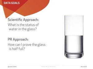
Beware of misleading data when taking a PR approach. Sandra Fathi, founder and president of Affect, introduced the concept of a PR approach (as opposed to a scientific approach) to collecting data. In a PR approach, she said, the goal is to help brands define "what is it you are trying to prove that correlates with the value of the product." She warned against the temptation of basing PR infographics on misleading survey results. On top of the ethical implications, infographics based on self-administered surveys and data from non-reputable sources tend to be less attractive to media outlets (although Fathi noted that desired methodology and survey sample size can vary from one outlet to another).
Don't bite off more than your reader can chew. Natalie Aljuni, director of marketing communications and demand generation at Synack, advised keeping infographics as clear and as concise as possible. She stressed the importance of defining individual goals for each separate panel of an infographic, avoiding statistics that are "all over the place." Steer clear of tackling too many concepts at once and confusing brand messaging in the process.
Storytelling is king. Roberts closed her presentation with an empowering message for PR professionals tackling infographics for the first time: "If you are able to take the ethos of your infographic and distill it to its simplest and most beautiful form, you'll have a story worth telling."
Follow Sandra: @sandrafathi
Follow Natalie: @najluni
Follow Sophie: @sophiemaerowitz