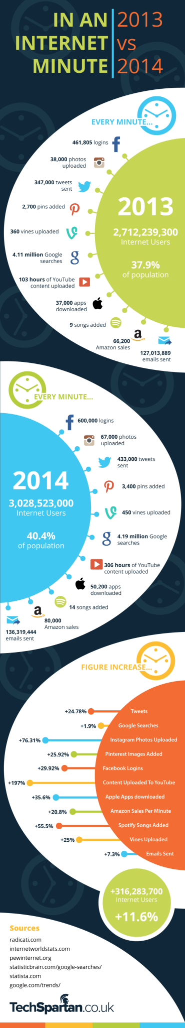
It should come as no surprise that overall Internet usage increased from 2013 to 2014. There has never been a year in which Internet use was not greater than the year before. For instance, last year ended with 316 million more Internet users than it started with. To put that growth in perspective, the United States, the third most populous country in the world, has 320 million people.
What is most important to communicators is not how many people are on the Internet but how they are spending their time. What are the most popular sites? What impact is social media having? Where are consumers spending their money?
This infographic from Holy Kaw! lays out that information in a unique way—by the minute. As a communicator, you’ll want to pay attention to the where the action is on the Internet. Sure, the 433,000 tweets sent each minute of 2014 is a 24 percent increase over the year before. But Instagram photo uploads per minute rose by 76 percent in 2014, suggesting steep growth for that platform. Similarly with YouTube, which saw a 197 percent increase in hours of content uploaded. The takeaway for your brand? Go visual.
Follow Richard Brownell: @RickBrownell