
Ask any journalist to give his/her thoughts on infographics and you should expect, at the very least, an eye roll. Though news outlets have used infographics since before the birth of the Internet and USA Today was an early pioneer in the medium [see http://www.slideshare.net/kehamilt/a-brief-history-of-information-graphicsinfographics], most people were unaware that such a thing existed until circa 2011, when marketers and public relations professionals realized that infographics were an effective way to get their brands and websites cited on highly trafficked news sites. The news industry, as you’ll remember, was hemorrhaging jobs in the wake of the recession, and suddenly here was some free content that generated good traffic and required little from the journalist other than a headline and intro paragraph.
Despite what you may have heard, there can be too much of a good thing. More and more companies jumped on the infographic bandwagon, and many of these new entrants didn’t know the first thing about visual storytelling, nor were they particularly fastidious with the facts. Suddenly you had journalists complaining about a glut of bad infographic pitches clogging their inboxes. Writing in The Atlantic (Dec. 23, 2011), Megan McArdle called for “ending the infographic plague” and claimed infographics were “being used to get unwitting bloggers to drive up their Google search rankings.” Martin Bryant in The Next Web (Dec. 27, 2011) wrote about the experience of getting burned when, after posting an infographic, he learned that many of its sources had been misattributed and its claims were misleading.
Though I tend to agree that there’s much more chaff than wheat these days in terms of infographic quality, I still think the infographic is a powerful vehicle for thought leadership and content marketing. When done well, data visualization can convey a powerful story that’s easily digested within moments, and it spreads across social platforms much more easily than text-based journalism. Despite complaints from reporters, data journalism is one of the fastest-growing sub-fields within the industry (see “Booming Market for Data-Driven Journalism,” by Roger Yu, USA Today, March 17, 2014).
The challenge is to break through a reporter’s noisy inbox and communicate to him/her that your infographic is accurate and provides value to his/her beat. Every journalist relies on sources for reporting, and infographics, when done well, can be considered another source. So the question: How can you get reporters to embed your infographic?
1. Tell an interesting story
Boil journalism down to its basic components and essentially it is storytelling. Many of the worst infographics merely blast off a list of statistics without attempting to form a coherent narrative. To interest a journalist in posting your infographic, you need to produce something that, when viewed, will radically change one’s understanding of a subject. That’s what the best journalism does.
2. Ensure accuracy
Journalists regard infographics that land in their inboxes with an increasing level of skepticism, and so it’s imperative that your use of data be unassailable. Did the statistics you cite come from an unscientific Internet poll? Did you make apples-to-oranges comparison with two completely different sources of data? Discerning readers will notice these things and pounce, so save yourself the trouble of having to retract your infographic by applying rigorous fact-checking. Also, any journalist worth his/her salt will demand sources for each claim made, so make sure to follow sourcing best practices when crafting the graphic.
3. Don’t skimp on design
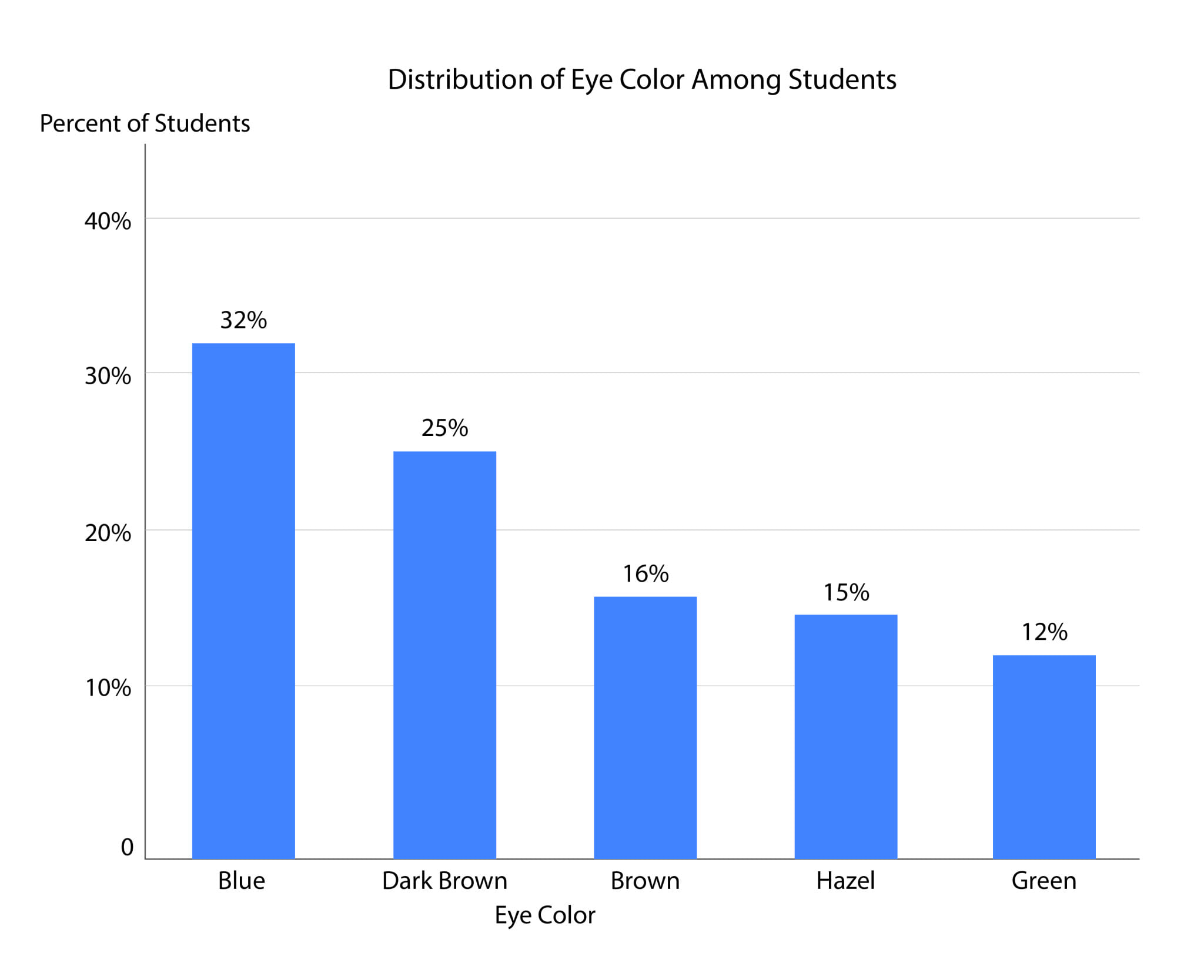
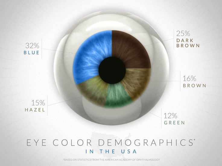
In addition to looking for quality data, journalists want infographics that are professionally designed. Attractive design reinforces the authority of the data. As an example, look at the difference between a boring Excel chart and more dramatic visualization (see next page). The image conveys the information more clearly, and makes an impression.
4. Peg your graphic to the news cycle
Journalism doesn’t exist in a vacuum. Journalists naturally will gravitate to content that’s relevant to current events. Creating any data visualization is a laborious process and it’s not always easy to generate an infographic within days after a major news event. Luckily it’s possible to anticipate media coverage in advance. For instance, you know that every year in April news outlets are going to be writing about filing taxes and that in the week prior to Thanksgiving they’ll be focused on Black Friday. The Super Bowl, the State of the Union, July 4 and myriad other national events occur regularly every year. Use the opportunity afforded you by the calendar to prepare a graphic that approaches these events from an original viewpoint.
5. Set up an exclusive
Having a long runway also would give you time to approach individual reporters and offer an exclusive on running your infographic. Not only does it give them more time to vet the content, journalists know being the first to publish something will increase the likelihood of generating heavy social media traffic to their post.
6. Avoid press releases and get personal
Not only does the publication of an infographic not warrant a press release, but a press release also signals to the journalist that it’s likely you’ve emailed the same thing to dozens of other reporters. This next part refers to infographics, sure, but also to any other pitch. Personal emails addressing the journalist by name and referencing a previous article, while taking longer to craft, will increase the chances that the reporter will at least read and consider your pitch.
7. Go niche
Let’s face it: Even if your design and sourcing are impregnable, a venerable institution like The New York Times still may be hesitant to publish a branded infographic. You’re probably better off targeting a niche blog or website. While they might not receive as much traffic as The Gray Lady, these sites typically have fervent followings within their industries and are able to deliver high-quality readers, which should be the focus of your content marketing anyway.
8. Partner with the media outlet
Rather than crafting the infographic and then approaching reporters with it, try contacting the reporter and offering to create an infographic in exchange for credit and a link. This will ensure the graphic fits within the journalist’s beat and also ease his/her worries about inaccurate information, since the reporter will play an integral role in the graphic’s creation. This tactic also has the benefit of exclusivity, which will entice the journalist further.
In Conclusion
Data journalism isn’t going away, and with the mainstream media continuing to contract, journalists are hungrier than ever for snackable content that will help them meet their daily article quotas. While any good reporter should be somewhat skeptical of corporate interests, there’s no reason why he should avoid posting a branded infographic as long as it’s properly vetted. So don’t let the glut of low-quality infographics dissuade you from creating high value content and incorporating it into your PR strategy.
CONTACT: Matt Cooper is CEO of Visually. Follow him @matt_cooper.
Thank you to Lauren Razzano, digital engagement specialist at Merlot Marketing in Sacramento, CA, for suggesting this story.
This article originally appeared in the September 28, 2015 issue of PR News. Read more subscriber-only content by becoming a PR News subscriber today.