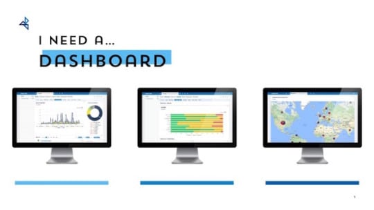
Forget about dashboards for a moment. I know they give you nightmares. You see them in your dreams—the badly coordinated colors and cryptic charts that you're presenting to your senior leaders. You try to explain the dashboard data in the boardroom, but nothing comes out of your mouth except desert winds. You wake up in a cold sweat.
Let's put all that aside for a moment.
Take a deep breath, and consider the business challenges of your organization, as if you didn't work for it. Then think of yourself as that organization's communications and marketing savior. What could you do to help that organization face those business challenges? Once you have an answer or two to that question, you're ready to start thinking about what your communications dashboard should look like.
This is a logical approach to take, one promoted by veterans of the long war to prove the value of communications to the C-suite. You may believe that this is the approach you've always taken with your dashboards, yet for some reason the C-suite remains unconvinced of the business value of your work.
At PR News' Measurement Boot Camp in New York on Nov. 9, 2017, Shilpa Mehta, principal analytical lead, Google, discussed three common sins of "dashboarding"—these are missteps that would indicate the problems have less to do with built-in C-suite skepticism and more to do with your dashboards, despite your laser focus on meeting business challenges.
Dashboard Sin #1: Too Much Data, Too Little Insight
"Sometimes we get so excited with data that we put everything in there," Mehta said. "Often, dashboards are not one-page affairs but rather 28-tab Excel files or 34-slide PowerPoint decks. Each tracks too many metrics, and rarely attempts to segment and highlight performance. The net result is that it is nearly impossible to distill a cogent understanding of what happened and what action should be taken now. Be a communicator, not a dump truck."
Dashboard Sin #2: TL;DR
When you have many charts in one dashboard it's hard to catch the eye of the reader, in which case you've got your classic "too long; didn't read" scenario. "We don't want senior leaders to think when they look at dashboards, we want them to take action," Mehta said. "As a general rule of thumb, your dashboard should contain fewer than 10 metrics."
Dashboard Sin #3: Pretty, But Empty-Headed
Focus on clarity of narrative in your dashboard, not beauty. "Have an insight and a narrative that is eye-catching and that immediately tells a senior leader what action she should take," Mehta said. "The goal in a dashboard is to communicate not just the performance of one metric but also to improve actionability."
Getting away from sins, Mehta said the greatest blessing you could bestow on your dashboard—and on your senior leaders—is a cogent set of insights (in words) that summarize performance and recommend action.
